














Rare Old Manuscript Map of Netherlands by Bowen, 1810: Amsterdam, Rotterdam, The Hague, Rhine, Zuiderzee
Restaurata nel nostro laboratorio di Londra dalla mappa originale del 1810 e stampata in qualità museale. Descrizione completa
L’offerta del Collezionista
Scegli due opere idonee e ricevi il 20% di sconto su entrambe. Scegline tre e quella al prezzo più basso è in omaggio, con un risparmio massimo del 33%.
Abbina liberamente mappe standard idonee e stampe d’arte fine art. Non è richiesto alcun codice; l’offerta viene applicata automaticamente al checkout.
Sono incluse le configurazioni standard su ordinazione. Sono esclusi formati su misura, design personalizzati e lavori su commissione.
Hai bisogno di consegne a indirizzi diversi? Contattaci prima di effettuare l’ordine.L’offerta del Collezionista
Scegli due opere idonee e ricevi il 20% di sconto su entrambe. Scegline tre e quella al prezzo più basso è in omaggio, con un risparmio massimo del 33%.
Abbina liberamente mappe standard idonee e stampe d’arte fine art. Non è richiesto alcun codice; l’offerta viene applicata automaticamente al checkout.
Sono incluse le configurazioni standard su ordinazione. Sono esclusi formati su misura, design personalizzati e lavori su commissione.
Hai bisogno di consegne a indirizzi diversi? Contattaci prima di effettuare l’ordine. Restaurato a Londra • Stampato e incorniciato nell’UE

Restaurata dalla mappa originale del 1810 e stampata in qualità museale. Descrizione completa
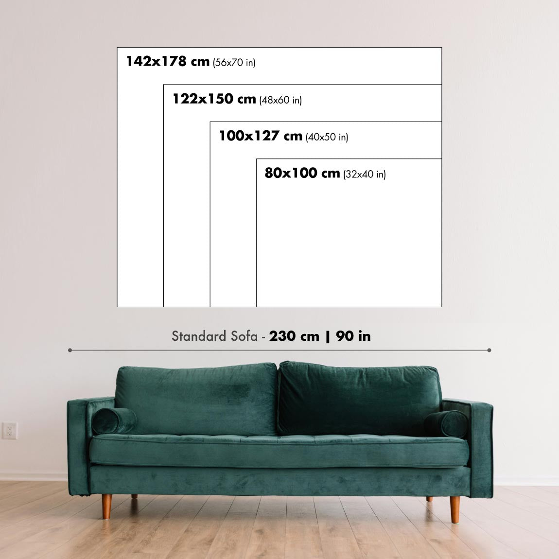
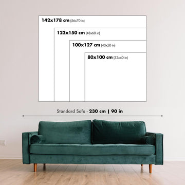
Scegli il formato
Scegli la finitura


(Maggiori informazioni)
Gift message & custom finish

If you want to add a gift message, or a finish (jigsaw, aluminium board, etc.) that is not available here, please request it in the "order note" when you check out.
Every order is custom made, so if you need the size adjusted slightly, or printed on an unusual material, just let us know. We've done thousands of custom orders over the years, so there's (almost) nothing we can't manage.
You can also contact us before you order, if you prefer!
Porta a casa un pezzo di storia
Oltre 8.000 recensioni a 5 stelle


The map titled “Netherlands,” created in 1810 by Frances Bowen, captures the Low Countries at a moment of profound European change. Executed...
Continua a leggereThe map titled “Netherlands,” created in 1810 by Frances Bowen, captures the Low Countries at a moment of profound European change. Executed in a lucid, handmade style, it presents a nation defined by water and trade, with regional borders set off by soft watercolor tints and a disciplined web of place names. Its date places it squarely within the Napoleonic era, when administrative identities were under pressure, yet historical provinces and familiar localities still anchored learning. The composition’s tidy geometry, with latitude and longitude marked along the edges, signals a didactic purpose: to teach orientation, relative position, and the language of borders in an age newly attuned to systematic knowledge.
Bowen’s authorship resonates with the educational manuscript tradition practiced by women in the early nineteenth century. Her work, long associated with that of her sister Eliza, reflects a classroom ethos that prized clarity, neat penmanship, and consistent color cues across a suite of maps—an atlas-in-miniature built for repeated reference. The spare elegance of the lines, the consistent treatment of boundaries, and the measured spacing of toponyms reveal an instructor’s logic: reduce complexity without sacrificing accuracy. In this sense, the map is both a lesson and a lens, distilling the Netherlands into a set of learnable relationships that students could retain and recall.
Geographically, the sheet honors the country’s defining waters: the Rhine and its Waal branch threading east to west, the Meuse (Maas) bending through the south, and the IJssel feeding the great inland inlet then known as the Zuiderzee. Zeeland’s lacework of estuaries and islands speaks to centuries of negotiation with sea and silt, while the Wadden fringe suggests shifting shoals and tidal flats. Along the North Sea littoral, a pared-down coast line reflects dunes, dikes, and harbors without fussy ornament. Regional divisions are crisp, allowing provinces to be read at a glance, while the bordering grid of meridians and parallels invites the viewer to situate Dutch space within the wider European frame.
The cartography methodically arrays the principal towns that structure the Dutch landscape. Amsterdam appears as mercantile heart, commanding the IJ and radiating canals; Rotterdam stands athwart the Maas as a rising port; and The Hague is calmly noted as the seat of government and diplomacy. Utrecht holds the country’s center, historically ecclesiastical and strategic. Leiden, with its venerable university, balances Haarlem on the North Holland coast. Breda signals the Brabantine south, while Nijmegen, ancient on the Waal, marks the eastern gate. Groningen anchors the north; and Eindhoven, still modest at the time, represents the evolving fabric of North Brabant. Each name is a fixed point in a network of waterways, trade routes, and provincial identities.
As a document of 1810, the map speaks to a transitional pedagogy and a transitional polity. The Netherlands—caught between inherited provincial structures and Napoleonic reordering—required learners to hold multiple frameworks in mind. Bowen’s neat borders, carefully chosen tints, and measured graticule transform that complexity into graspable form, signaling the early nineteenth century’s drive toward structured geographic education. The manuscript’s balance of precision and restraint—craft and concept—makes it more than a schoolroom exercise. It is a window onto the period’s intellectual discipline, a portrait of a water-shaped nation, and a quietly authoritative guide to Dutch space at the hinge of modern Europe.
Cities and towns on this map
- Amsterdam
- Rotterdam
- The Hague (Den Haag)
- Utrecht
- Eindhoven
- Groningen
- Breda
- Leiden
- Nijmegen
- Haarlem
Notable Features & Landmarks
- Boundaries: Clearly delineated regional borders.
- Place Names: Various identified locations across the map.
- Watercolor Highlights: Aesthetic enhancements that guide the viewer's attention to specific areas.
- Geographic Orientation: Latitude and longitude markings along the edges.
Historical and design context
- Date Made: 1810.
- Mapmaker: Frances Bowen.
- Interesting Context About Mapmaker: Associated with her sister, Eliza, emphasizing the educational purposes common in manuscript maps of the time.
- Design or Style: Tidy layout with precise execution typical of classroom maps; blends functionality with the craft of hand-drawn art.
- Extra Notes: Manuscript map reflecting the handmade style of early nineteenth-century educational cartography; drawn in pen and ink; likely part of a broader atlas project designed to assist education.
- Historical Significance: Emblematic of the transition in educational resources, showcasing the movement toward structured geographic education in the early 1800s.
Please double check the images to make sure that a specific town or place is shown on this map. You can also get in touch and ask us to check the map for you.
This map looks great at every size, but I always recommend going for a larger size if you have space. That way you can easily make out all of the details.
This map looks amazing at sizes all the way up to 50in (125cm). If you are looking for a larger map, please get in touch.
The model in the listing images is holding the 16x20in (40x50cm) version of this map.
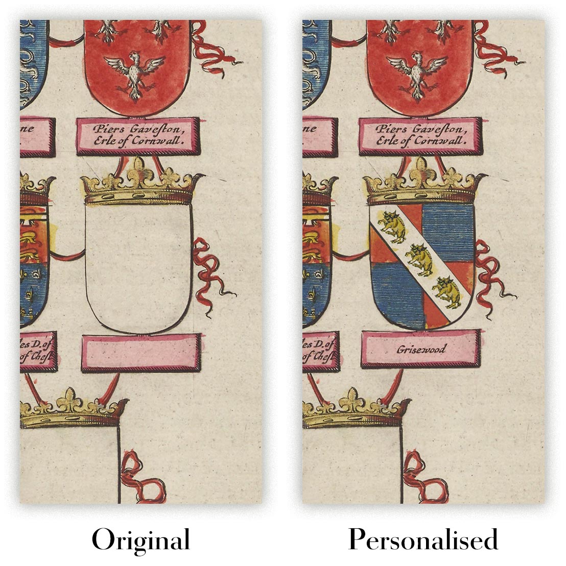
The fifth listing image shows an example of my map personalisation service.
If you’re looking for something slightly different, check out my collection of the best old maps to see if something else catches your eye.
Please contact me to check if a certain location, landmark or feature is shown on this map.
This would make a wonderful birthday, Christmas, Father's Day, work leaving, anniversary or housewarming gift for someone from the areas covered by this map.
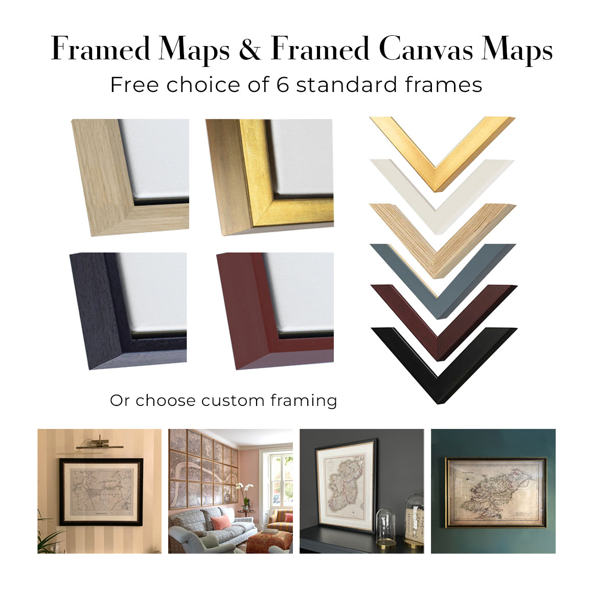
This map is available as a giclée print on acid free archival matte paper, or you can buy it framed. The frame is a nice, simple black frame that suits most aesthetics. Please get in touch if you'd like a different frame colour or material. My frames are glazed with super-clear museum-grade acrylic (perspex/acrylite), which is significantly less reflective than glass, safer, and will always arrive in perfect condition.
This map is also available as a float framed canvas, sometimes known as a shadow gap framed canvas or canvas floater. The map is printed on artist's cotton canvas and then stretched over a handmade box frame. We then "float" the canvas inside a wooden frame, which is available in a range of colours (black, dark brown, oak, antique gold and white). This is a wonderful way to present a map without glazing in front. See some examples of float framed canvas maps and explore the differences between my different finishes.
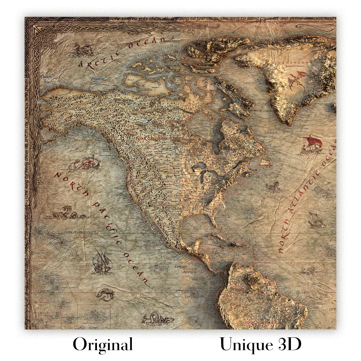
For something truly unique, this map is also available in "Unique 3D", our trademarked process that dramatically transforms the map so that it has a wonderful sense of depth. We combine the original map with detailed topography and elevation data, so that mountains and the terrain really "pop". For more info and examples of 3D maps, check my Unique 3D page.
The map titled “Netherlands,” created in 1810 by Frances Bowen, captures the Low Countries at a moment of profound European change. Executed in a lucid, handmade style, it presents a nation defined by water and trade, with regional borders set off by soft watercolor tints and a disciplined web of place names. Its date places it squarely within the Napoleonic era, when administrative identities were under pressure, yet historical provinces and familiar localities still anchored learning. The composition’s tidy geometry, with latitude and longitude marked along the edges, signals a didactic purpose: to teach orientation, relative position, and the language of borders in an age newly attuned to systematic knowledge.
Bowen’s authorship resonates with the educational manuscript tradition practiced by women in the early nineteenth century. Her work, long associated with that of her sister Eliza, reflects a classroom ethos that prized clarity, neat penmanship, and consistent color cues across a suite of maps—an atlas-in-miniature built for repeated reference. The spare elegance of the lines, the consistent treatment of boundaries, and the measured spacing of toponyms reveal an instructor’s logic: reduce complexity without sacrificing accuracy. In this sense, the map is both a lesson and a lens, distilling the Netherlands into a set of learnable relationships that students could retain and recall.
Geographically, the sheet honors the country’s defining waters: the Rhine and its Waal branch threading east to west, the Meuse (Maas) bending through the south, and the IJssel feeding the great inland inlet then known as the Zuiderzee. Zeeland’s lacework of estuaries and islands speaks to centuries of negotiation with sea and silt, while the Wadden fringe suggests shifting shoals and tidal flats. Along the North Sea littoral, a pared-down coast line reflects dunes, dikes, and harbors without fussy ornament. Regional divisions are crisp, allowing provinces to be read at a glance, while the bordering grid of meridians and parallels invites the viewer to situate Dutch space within the wider European frame.
The cartography methodically arrays the principal towns that structure the Dutch landscape. Amsterdam appears as mercantile heart, commanding the IJ and radiating canals; Rotterdam stands athwart the Maas as a rising port; and The Hague is calmly noted as the seat of government and diplomacy. Utrecht holds the country’s center, historically ecclesiastical and strategic. Leiden, with its venerable university, balances Haarlem on the North Holland coast. Breda signals the Brabantine south, while Nijmegen, ancient on the Waal, marks the eastern gate. Groningen anchors the north; and Eindhoven, still modest at the time, represents the evolving fabric of North Brabant. Each name is a fixed point in a network of waterways, trade routes, and provincial identities.
As a document of 1810, the map speaks to a transitional pedagogy and a transitional polity. The Netherlands—caught between inherited provincial structures and Napoleonic reordering—required learners to hold multiple frameworks in mind. Bowen’s neat borders, carefully chosen tints, and measured graticule transform that complexity into graspable form, signaling the early nineteenth century’s drive toward structured geographic education. The manuscript’s balance of precision and restraint—craft and concept—makes it more than a schoolroom exercise. It is a window onto the period’s intellectual discipline, a portrait of a water-shaped nation, and a quietly authoritative guide to Dutch space at the hinge of modern Europe.
Cities and towns on this map
- Amsterdam
- Rotterdam
- The Hague (Den Haag)
- Utrecht
- Eindhoven
- Groningen
- Breda
- Leiden
- Nijmegen
- Haarlem
Notable Features & Landmarks
- Boundaries: Clearly delineated regional borders.
- Place Names: Various identified locations across the map.
- Watercolor Highlights: Aesthetic enhancements that guide the viewer's attention to specific areas.
- Geographic Orientation: Latitude and longitude markings along the edges.
Historical and design context
- Date Made: 1810.
- Mapmaker: Frances Bowen.
- Interesting Context About Mapmaker: Associated with her sister, Eliza, emphasizing the educational purposes common in manuscript maps of the time.
- Design or Style: Tidy layout with precise execution typical of classroom maps; blends functionality with the craft of hand-drawn art.
- Extra Notes: Manuscript map reflecting the handmade style of early nineteenth-century educational cartography; drawn in pen and ink; likely part of a broader atlas project designed to assist education.
- Historical Significance: Emblematic of the transition in educational resources, showcasing the movement toward structured geographic education in the early 1800s.
Please double check the images to make sure that a specific town or place is shown on this map. You can also get in touch and ask us to check the map for you.
This map looks great at every size, but I always recommend going for a larger size if you have space. That way you can easily make out all of the details.
This map looks amazing at sizes all the way up to 50in (125cm). If you are looking for a larger map, please get in touch.
The model in the listing images is holding the 16x20in (40x50cm) version of this map.
The fifth listing image shows an example of my map personalisation service.
If you’re looking for something slightly different, check out my collection of the best old maps to see if something else catches your eye.
Please contact me to check if a certain location, landmark or feature is shown on this map.
This would make a wonderful birthday, Christmas, Father's Day, work leaving, anniversary or housewarming gift for someone from the areas covered by this map.
This map is available as a giclée print on acid free archival matte paper, or you can buy it framed. The frame is a nice, simple black frame that suits most aesthetics. Please get in touch if you'd like a different frame colour or material. My frames are glazed with super-clear museum-grade acrylic (perspex/acrylite), which is significantly less reflective than glass, safer, and will always arrive in perfect condition.
This map is also available as a float framed canvas, sometimes known as a shadow gap framed canvas or canvas floater. The map is printed on artist's cotton canvas and then stretched over a handmade box frame. We then "float" the canvas inside a wooden frame, which is available in a range of colours (black, dark brown, oak, antique gold and white). This is a wonderful way to present a map without glazing in front. See some examples of float framed canvas maps and explore the differences between my different finishes.
For something truly unique, this map is also available in "Unique 3D", our trademarked process that dramatically transforms the map so that it has a wonderful sense of depth. We combine the original map with detailed topography and elevation data, so that mountains and the terrain really "pop". For more info and examples of 3D maps, check my Unique 3D page.
Molte delle nostre mappe e stampe d’arte vengono scelte come regali premurosi per case, uffici, studi e luoghi significativi.
Scegli un’opzione incorniciata per il regalo più semplice, pronto da appendere, oppure scegli una stampa non incorniciata se il destinatario preferisce selezionare la propria cornice.
Realizziamo gli ordini localmente in 23 paesi in tutto il mondo, così i regali possono spesso essere prodotti vicino al destinatario. Questo li aiuta ad arrivare più rapidamente, a viaggiare in maggiore sicurezza e a evitare sorprese legate a dazi doganali o di importazione.
- Possiamo consegnare direttamente al destinatario
- I pezzi incorniciati arrivano pronti da appendere
- Le stampe non incorniciate sono accuratamente imballate in un robusto tubo protettivo
- Quasi ogni ordine viene realizzato localmente, per regali più rapidi e sicuri
- Il reso entro 90 giorni dà al destinatario il tempo di decidere
Se non sei sicuro di cosa scegliere, ti invitiamo a contattarci. Possiamo aiutarti a scegliere la mappa, il formato, la finitura o l’opzione di consegna più adatti.
Most orders are made locally and delivered in around 2–3 working days, depending on the product, size and destination.
We print and frame maps and artwork in 24 countries around the world, so your order is usually made close to you or your recipient. That means faster delivery, less time in transit, and no customs or import duty surprises.
Personalised and customised pieces usually take an extra 1–2 working days, because we prepare your design and send it to you for approval before printing.
Very large framed orders can take a little longer, as they need extra care in production and delivery.
Every order is carefully packaged: unframed prints are sent in a strong protective tube, while framed pieces are securely packed with protective materials around the frame.
If you need your order by a particular date, please contact us before ordering. We’ll check the best production route and delivery option for your location.
Express delivery is available at checkout for most countries. Next-day delivery is available in the UK, US, Singapore and the UAE.
Your order is covered by our 90-day returns policy and 10-year guarantee.
Our standard frame is a gallery-style black ash hardwood frame, with a simple, modern look. It is approximately 20mm (0.8in) wide. You can also view some lovely customer photos of framed maps and art.
We use super-clear acrylic glazing, also known as Perspex or Acrylite, instead of traditional glass. It is lighter, safer, and has lower reflectivity, giving the artwork a clearer, cleaner appearance.
Six standard frame colours are available at no extra cost: black, dark brown, dark grey, oak, white, and antique gold. Custom framing and mounting/matting is also available for customers looking for something more specific.
Most maps, art prints, and illustrations are also available as a framed canvas. We use matte cotton canvas, stretch it over a sustainably sourced wooden box frame, and then float the piece within a wooden outer frame. The finished result is beautifully presented, with no glazing between you and the artwork.
All frames are supplied ready to hang, with either string or brackets fitted to the back. Very large frames will include heavy-duty hanging plates and/or a mounting baton. If you have any questions, please get in touch.
We can also supply old maps and artwork on canvas, foam board, cotton rag, and other materials.
If you would prefer to frame your map or artwork yourself, please read our size guide before ordering.
Lavoriamo con interior designer, strutture ricettive, professionisti del settore immobiliare, uffici e acquirenti aziendali su singoli pezzi e su progetti coordinati di più ampia portata.
Questa mappa può essere adattata a una particolare parete, stanza o progetto, e il nostro laboratorio può aiutare a coordinare dimensioni, materiale e incorniciatura prima della produzione.
- Dimensioni precise, extra-large e su misura
- Incorniciatura, montaggio e materiali alternativi personalizzati
- Pezzi coordinati per più stanze o sedi
- Personalizzazione della mappa, per evidenziare luoghi importanti o aggiungere dettagli supplementari
- Consulenza su mappa e incorniciatura dal nostro laboratorio
- Produzione locale per progetti in tutto il mondo
Every Unique Maps piece begins with an authentic cartographic source or an original design from our London studio.
For our historic maps, we source rare originals from libraries, archives, auction houses and private collections around the world. We carefully restore each map for print—repairing age-related damage, balancing colour and improving clarity while preserving its original detail, texture and character.
Once restored, the map is prepared for your chosen size and finish. Your piece is then printed and, where selected, framed close to its delivery destination.
Our map prints use acid-free 200gsm archival matte paper and fade-resistant pigment inks, creating a rich, non-glossy finish designed to last. Framed maps use crystal-clear optical acrylic and arrive ready to hang.
Canvas, cotton-rag and other specialist presentations are also available. Learn more about our materials and finishes.
Personalising your map
You can add a short title or dedication, mark one meaningful place, or request one considered visual detail. For personalised designs, we send a proof before printing and you can request changes before approval.
For more complex bespoke commissions, contact our design team.
Original or Aged
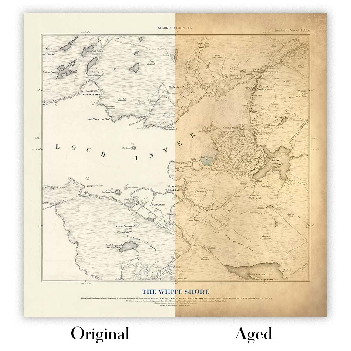
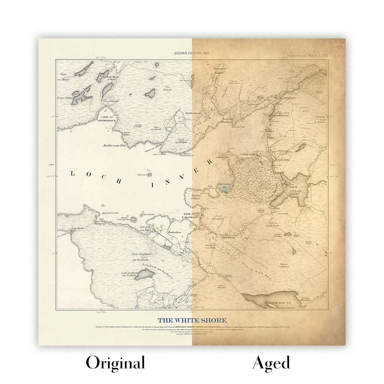
Choose Original for true-to-source colour, or Aged for a warmer, richer antique character created with our specialist ageing process. See examples of our Aged maps.
Restauriamo e produciamo mappe e stampe d’arte dal 1984, e garantiamo personalmente ogni pezzo.
Ogni ordine è coperto dalla nostra garanzia di 10 anni e dalla garanzia di consegna senza danni. Se il vostro pezzo arriva danneggiato, lo sostituiremo o lo rifaremo gratuitamente. Se qualsiasi altro aspetto non fosse conforme, contattate il nostro team di laboratorio e provvederemo tempestivamente a risolvere il problema.
Per tutti i dettagli, consultate la nostra politica su resi e rimborsi.
Oppure cerca qualcosa nel negozio.


